
How to Choose Bedding That Matches Your Room’s Color Scheme
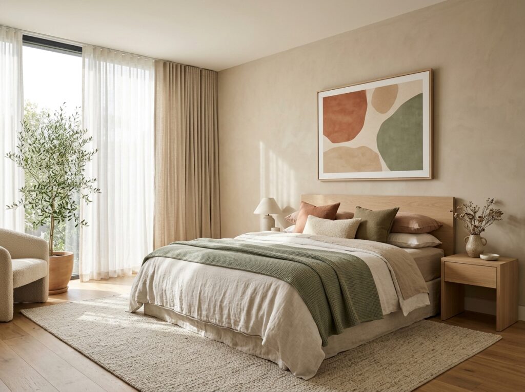
You have probably seen it happen: a bedroom looks beautifully painted, the furniture is right, and yet the bed feels disconnected from everything around it. Most of the time, the culprit is not the wall color or the rug — it is bedding chosen in isolation rather than as part of the room. Getting this right starts with two details people often skip: the actual color values in the room and the finished size of the pillows themselves. Standard pillowcases are typically designed around the standard pillow size in inches //pillowshowcase.com/pillow-faq-guides/pillow-size-and-dimensions-chart/, and knowing that measurement helps you judge how a color or pattern will actually look at scale rather than on a screen. The steps below show you how to build a bedding palette that feels intentional, not accidental.
Quick Answer
Start with the colors already fixed in the room — walls, flooring, and large furniture — then choose bedding in one of three relationships: match the dominant color, match an accent color, or use a neutral base with one accent pulled from the room. Limit your palette to two or three colors, repeat the accent at least once elsewhere in the room, and check pillow dimensions so your chosen cases fit properly. Neutrals with one anchor color are the most forgiving and the easiest to update later.
Key Takeaways
- Work from the colors you cannot easily change — walls, floor, and large furniture — before choosing bedding.
- A simple formula works best: one neutral base plus one accent color, with a third tone used sparingly.
- Confirm your pillow dimensions first, since size affects how pattern and color read on the bed.
- Match undertones, not just colors, or a palette that should work will still look slightly off.
- Pattern scale matters: small prints read as texture from a distance, while large prints become a focal point.
Start With What You Cannot Change
The most common bedding mistakes come from shopping for bedding first and trying to build the room around it afterward. It is far easier to work in the opposite direction. Identify the fixed elements — wall color, flooring, window treatments, and the dominant color of large furniture such as a bed frame, dresser, or wardrobe — and treat those as your starting palette.
Write down the actual colors rather than relying on memory. A wall that looks “grey” in daylight may be a warm greige with strong yellow undertones, and that detail determines whether cool blue bedding looks crisp or slightly mismatched against it. If you can, hold fabric swatches near the wall at different times of day, since artificial lighting at night can shift a color noticeably compared to morning light.
Once you have three or four fixed colors, you have a working palette. Everything you add — bedding, throws, lampshades — should relate to at least one of those colors.
Pick One of Three Color Strategies
Almost every well-matched bedroom falls into one of three approaches. Choosing your strategy before you shop prevents the drifting, piecemeal look that comes from buying items one at a time without a plan.
Tonal matching
Tonal matching means choosing bedding in the same color family as the room but in a different shade or lightness. A sage-green wall paired with deeper forest-green bedding and lighter pistachio accents is tonal. This approach looks calm and cohesive, and it is very forgiving because slight variations still read as intentional.
Contrast matching
Contrast matching sets bedding against the room for deliberate visual interest. A dark navy bed set against pale cream walls makes the bed the focal point. This works well in rooms with restrained architecture or plain walls, because the bedding itself supplies the visual weight. The trade-off is that contrast draws the eye immediately, so any creasing, fading, or mismatch on the bed is more noticeable.
Accent pulling
Accent pulling means keeping the bedding mostly neutral and using one color drawn from somewhere else in the room. If your curtains have a muted terracotta edge, bedding with a similar terracotta stripe ties the two together. This is the most flexible strategy because you can change the accent later without repainting or replacing furniture.
Match Undertones, Not Just Colors
Two colors can be the same in name and still clash, because undertones differ. Undertones are the subtle secondary hues within a color — a blue can lean grey and cool, or lean green and slightly warm. When warm and cool undertones sit next to each other without a neutral bridge, both can look slightly “off” even though no single item is wrong.
A practical test: place the bedding fabric and a wall or furniture swatch side by side in natural daylight. If one makes the other look dull, yellowed, or muddy, the undertones are fighting. If they look harmonious or the contrast feels deliberate, you are fine.
- Warm-leaning rooms (creams, terracotta, warm woods) usually suit warm whites, oatmeal, camel, rust, and olive.
- Cool-leaning rooms (grey, blue-grey, cool whites) usually suit crisp white, slate, navy, silver-grey, and cool greens.
- If your room mixes both, use a true neutral — a balanced white or greige — as the bridge color in your bedding.
Confirm Pillow Sizes Before You Buy Cases
Color is only half the decision. Bedding that fits poorly looks wrong regardless of how well the palette works, and pillow sizing is where most fit problems start. A standard pillowcase is designed for a standard pillow, and if you buy cases without checking dimensions, you can end up with fabric that bunches at the corners or a pillow that looks underfilled inside an oversized case.
| Pillow type | Typical size | Common use |
|---|---|---|
| Standard | About 20 x 26 inches | Single sleeper, twin and full beds |
| Queen | About 20 x 30 inches | Queen beds, wider sleepers |
| King | About 20 x 36 inches | King beds, longer frames |
| Euro sham | About 26 x 26 inches | Decorative layering at the head of the bed |
These are approximate industry ranges, and actual products can vary by manufacturer, so check the specific listing. The practical point is that pillow size changes how much fabric is visible, and that in turn changes how your color choices read. Two standard pillows on a queen bed leave more visible sheet and duvet; a row of large euro shams fills the head of the bed and pushes your accent color higher, closer to eye level.
Size also affects pattern. A busy small-scale print on a standard pillowcase looks dense and textural. The same print on a king sham becomes a much larger visual block, which can overwhelm a small room. If you want a bold pattern, keeping it on smaller accent pillows usually gives you more control than putting it on the largest surface.
Use the 60-30-10 Approach as a Guide
A widely used interior guideline splits a room’s palette roughly into dominant, secondary, and accent proportions. Applied to bedding, it looks like this:
- Roughly 60% dominant: your main bedding color, usually a neutral or a tonal match to the walls.
- Roughly 30% secondary: a duvet, quilt, or blanket in a related but distinct shade.
- Roughly 10% accent: throw pillows, a folded throw, or trim in the color you want to pop.
This is a guideline, not a rule. The value is that it prevents the most common failure mode — an even split of three competing colors that leaves the eye with nowhere to rest. If you are unsure, err toward more neutral and less accent, then add.
Handle Patterns and Textures Carefully
Color is the first layer; pattern and texture are the second. A room with strong pattern on the walls, rug, or curtains often needs quieter bedding. A plain room can carry a patterned duvet comfortably.
Two working principles help:
- Use one pattern, not three. If the duvet is patterned, keep pillows and sheets solid or subtly textured. If the rug is patterned, keep bedding largely solid.
- Vary scale when combining. A large-scale floral and a small-scale stripe can coexist if the scales differ clearly. Two medium-scale patterns usually compete.
Texture is the low-risk way to add interest without adding color. Linen, waffle weave, ribbed cotton, and chunky knits read as dimensional from across the room and rarely clash, making them useful when you want a room to feel layered without committing to a new palette.
Common Mistakes to Avoid
- Buying bedding before assessing the room. This locks you into a color that may not relate to anything you already own.
- Ignoring lighting direction. North-facing rooms receive cooler light and can make warm colors look flat; south-facing rooms intensify warm tones.
- Matching everything too exactly. Perfectly identical shades across bedding, curtains, and rug can look flat. Slight variation adds depth.
- Forgetting the third repeat. An accent color that appears only on the bed can look stray rather than intentional. Repeat it somewhere else — a lamp, artwork, or cushion on a chair.
- Overlooking pillow fit. Cases that are too large or small undermine an otherwise well-planned bed.
Frequently Asked Questions
Should bedding match the walls exactly?
No. An exact match tends to look flat and can make the bed disappear into the room. A tonal variation — same family, different shade — usually looks more considered and gives the bed definition.
What is the easiest bedding color to work with?
White, off-white, oatmeal, and light grey are the most flexible because they bridge warm and cool elements. They also make it easy to change accent colors later without replacing the base bedding.
How many colors should a bedroom have?
Two or three is usually enough. One dominant color, one supporting tone, and one accent keeps the room cohesive without becoming busy. More than that tends to compete for attention.
Does pillow size really affect how bedding looks?
Yes. Larger pillows and shams take up more visual space and shift where your accent color sits on the bed. Smaller pillows read as detail rather than as a major color block.
Can I mix warm and cool colors in one bedroom?
You can, but you need a bridge. A true neutral — a balanced white or greige — placed between them usually stops the warm and cool tones from fighting each other.
How do I update bedding without repainting?
Keep the base neutral and change only the accent layer: throw pillows, a folded throw, or a duvet in a different shade. This is the cheapest way to shift the room’s mood without touching the walls.
Conclusion
Matching bedding to your room comes down to a sequence, not guesswork. Assess the fixed colors first, choose a strategy — tonal, contrast, or accent pulling — and limit yourself to two or three colors with one clear accent. Match undertones, confirm your pillow dimensions before buying cases, and use texture to add depth without adding clutter. If you want the simplest path, start with a neutral base and one accent pulled from something already in the room; you can always build from there.